
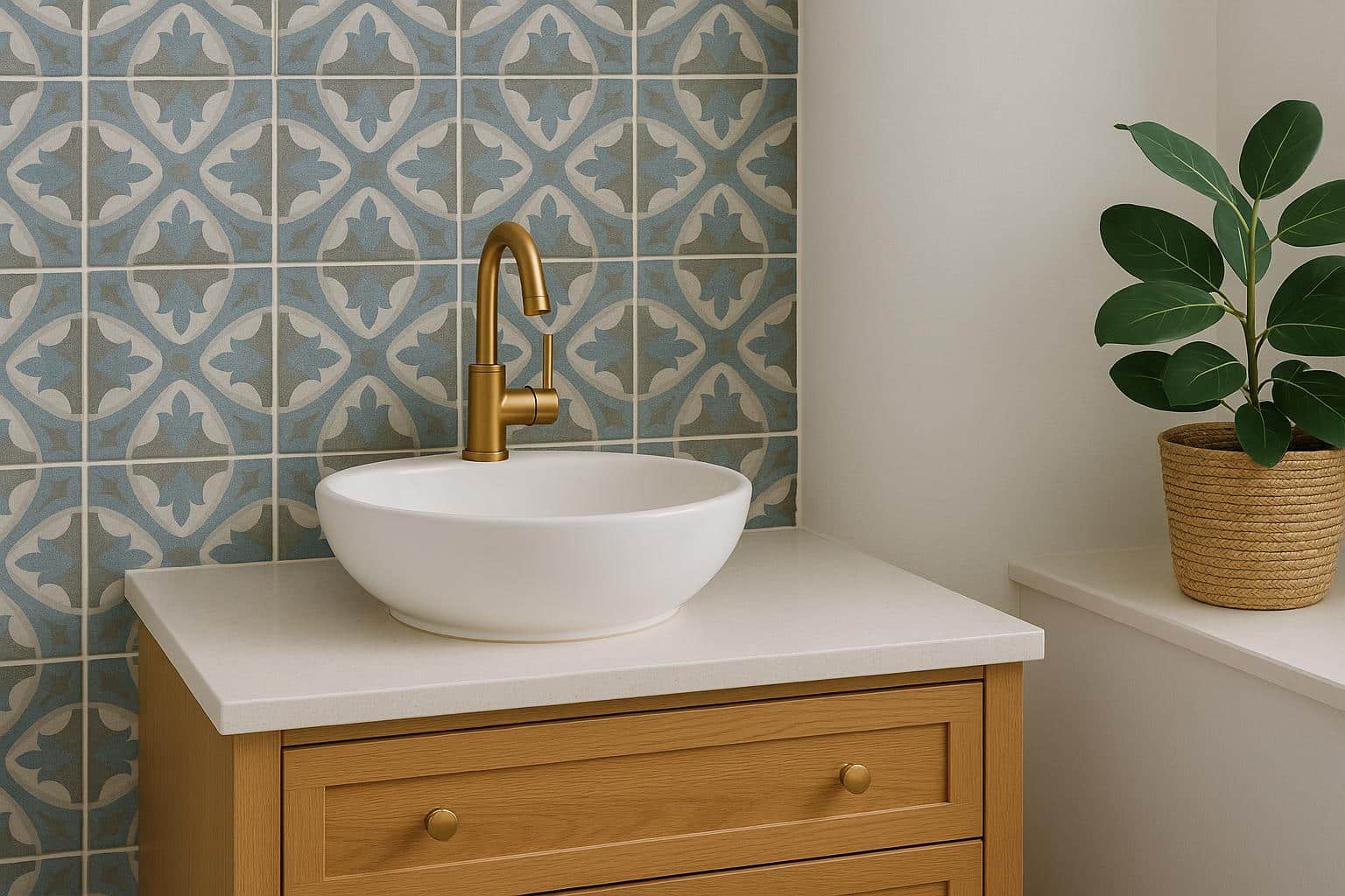
Patterned tiles can completely change the personality of a room. They can make a small bathroom feel more considered, give a hallway a stronger sense of character or turn an otherwise plain kitchen into something much more memorable. The challenge is knowing when to stop.
Used well, patterned floor tiles can create interest without making a space feel visually overloaded. The trick is usually not to avoid boldness altogether, but to give the pattern enough breathing room so it feels intentional rather than chaotic.
Contents
- Let the Floor Do the Talking
- Smaller Rooms Can Actually Handle More Pattern Than You Think
- Colour Is Usually the Bigger Decision
- Repetition Can Make Bold Tiles Feel More Intentional
- Think About How the Pattern Will Look Across the Whole Floor
- Transitional Spaces Are Great Places to Experiment
- Kitchens Need a Little More Restraint
- Pattern Can Help Older Homes Feel More Connected
- Don’t Forget the Grout
- A Pattern Doesn’t Need to Be Loud to Be Interesting
Let the Floor Do the Talking
One of the easiest ways to use patterned tiles is to make them the main decorative feature and keep the rest of the room relatively calm. If the floor already contains strong geometry, multiple colours or a noticeable motif, there may be no need to compete with it through equally busy walls, cabinetry or furnishings.
This doesn’t mean the rest of the space has to be bland. Texture can do a lot of work without adding more visual noise. Timber, stone, simple painted surfaces and soft textiles can all complement a patterned floor while allowing it to remain the focal point. The result tends to feel more balanced because the eye has somewhere obvious to land.
Smaller Rooms Can Actually Handle More Pattern Than You Think
There’s a common assumption that small spaces need plain finishes, but that isn’t always true. A compact powder room, entryway or laundry can be an excellent place to use stronger tile patterns because the area is contained.
In a small room, the pattern can almost function like wallpaper. It creates a distinct identity without spreading across a huge portion of the home. That can make spaces people normally treat as purely functional feel much more deliberate. The key is scale. A very large, dramatic motif may overwhelm a tiny floor, while a smaller repeating design can create movement without taking over the entire room.
Colour Is Usually the Bigger Decision
Pattern gets most of the attention, but colour often determines whether a tiled space feels cohesive. If the tile includes several colours, choosing one of those shades for nearby cabinetry, walls or accessories can help tie everything together. You don’t necessarily need an exact match. Even repeating a similar tone somewhere else in the room can make the pattern feel connected to the overall design.
Neutral patterned tiles are especially useful if you like the idea of movement but don’t want the space to feel too loud. Black and white, soft grey, warm beige or muted earthy tones can still create a strong look without introducing a complicated colour palette.
Repetition Can Make Bold Tiles Feel More Intentional
A patterned floor often looks more convincing when one or two of its visual elements appear elsewhere in the space. That might mean repeating a black line from the tile through tapware, using timber tones that complement warmer colours in the pattern or choosing pendant lights with a shape that echoes the tile geometry.
You don’t need to copy the pattern itself. In fact, doing that too literally can make the room feel themed. Subtle repetition is enough. It creates a sense that the floor belongs to the room rather than looking like an interesting surface chosen in isolation.
Think About How the Pattern Will Look Across the Whole Floor
A single tile sample can be misleading. Some designs only make sense once several tiles are laid together, while others create larger repeating shapes that aren’t obvious from looking at one piece. This can dramatically change how busy or calm the final floor feels.
It’s worth viewing a larger sample or layout before committing. Pay attention to how frequently the pattern repeats, where lines meet and whether the overall effect feels more graphic than expected. This is particularly important in larger rooms, where a pattern that looks subtle on one tile may become much more dominant once repeated dozens of times.
Transitional Spaces Are Great Places to Experiment
Hallways, entries and mudrooms are particularly suited to patterned flooring because they naturally act as transitions between other spaces.
A bolder floor in an entry can create a strong first impression without dictating the style of every adjoining room. Similarly, patterned tiles in a hallway can add interest to an area that might otherwise feel purely functional.
These spaces also tend to have fewer competing design elements. There may be less furniture and fewer large decorative surfaces, which gives the tile more room to stand out without feeling crowded.
Kitchens Need a Little More Restraint
Patterned kitchen floors can look fantastic, but kitchens already contain a lot of visual information. Cabinetry, appliances, benchtops, splashbacks, handles and lighting all compete for attention.
If the floor is going to be bold, it often helps to keep at least one or two of those other elements simpler. A patterned floor with plain cabinetry and a restrained splashback can feel energetic without becoming exhausting. The reverse also works. If you already have a dramatic stone benchtop or colourful splashback, a quieter floor may be the better choice.
The goal is contrast, not competition.
Pattern Can Help Older Homes Feel More Connected
Patterned tiles can work particularly well in period homes because they can introduce visual detail that feels appropriate to the architecture. Hallways, bathrooms and verandahs can all benefit from designs that reference traditional geometric or decorative styles.
That doesn’t mean the entire house needs to become historically accurate. A traditional-inspired tile can sit comfortably alongside contemporary fixtures and fittings if the colour palette is handled carefully. This mix of old and new can often feel more natural than trying to make every element belong to exactly the same era.
Don’t Forget the Grout
Grout colour can significantly change how patterned tiles read. A high-contrast grout can emphasise each individual tile and make the grid more visible. A closer colour match tends to soften those boundaries and allow the larger pattern to come through more clearly.
There’s no universally correct choice. It depends on whether you want the floor to feel crisp and graphic or a little more blended.
It’s worth testing grout colours with the actual tile rather than deciding from a small chart, because the surrounding colours can shift how the grout looks once everything is installed.
A Pattern Doesn’t Need to Be Loud to Be Interesting
The best patterned floors aren’t always the boldest ones. Sometimes a subtle geometric repeat, soft encaustic-style motif or limited colour palette adds just enough variation to stop a room feeling flat. You notice the floor without feeling as though it’s demanding your attention every time you walk into the room.
That’s usually the sweet spot. Patterned tiles work best when they feel like part of the architecture rather than decoration dropped on top of it. Give them space, let the surrounding finishes support them and resist the urge to make every surface equally interesting.
A room only needs one thing to be the star.